
Often, you’ll see charts like the following in banking materials.
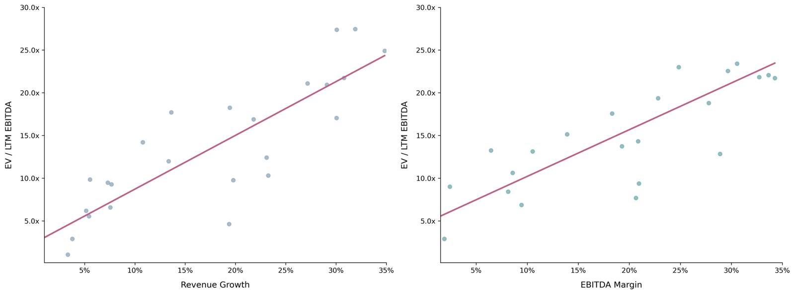
Figure 1: Typical regression analysis in investment banking materials
Deep down, we all know this isn’t a great analysis. But regardless of our gut feelings, it’s still being used. What we want to do here is understand why small sample regression analysis can lead us astray and discuss some ways to make it better.
To start, suppose we have a true model of valuation and it’s the following:
Meaning that for a company with revenue growth of 0%, the EV / LTM EBITDA valuation will be 2.0x. For a company with revenue growth of 15%, the EV / LTM EBITDA valuation will be 12.5x. For the discerning regression pros, we’re not going to deal with log independent variables and elasticities. We’re just keeping it simple. So, for a 15% change in revenue growth, you get , and that’s how you get to the 12.5x.
In real life, we don’t observe this “true” model. Instead, we see some scatterplot of data about this line (i.e., our data will have some noise):
Now let’s suppose, because of this “noise,” the best we can do is generate a regression line and scatterplot of data that would lend an R-squared of 70%. If we had 1,000 data points, this line would look like the left-hand side graph in Figure 2. But, if we had only 25 data points, it would look like the right-hand side graph in Figure 2.
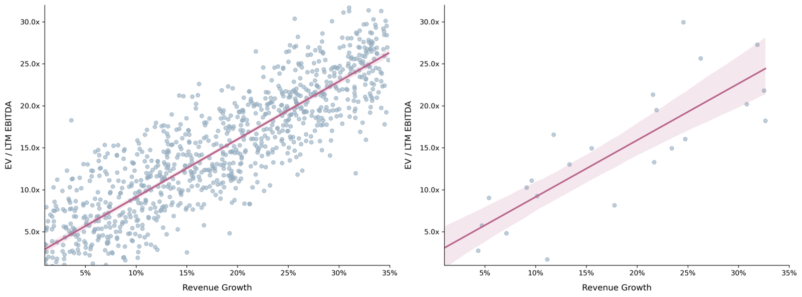
Figure 2: Impact of sample size on confidence intervals
On the left-hand side graph, you can barely see the shaded coloring around the regression line. That’s because you have a large number of observations (i.e., 1,000) to depend on. So your confidence level in the placement of the regression line is narrow. On the right-hand side graph, you can see the shaded coloring around the regression line to be wider, because you have a mere 25 data points to depend on.
In banking materials, this shaded region is almost never presented. But it’s instrumental to show it when the sample size is so small, because it can help inform the valuation of the company you are advising. And it can give an additional sanity check on the potential valuation range that you as an advisor will propose.
Let’s suppose that we are advising a client with 10% revenue growth and EBITDA of $25M. In our hypothetical sample shown in the right-hand side graph of Figure 2, this would imply lower and upper EV / LTM EBITDA values of 7.1x and 11.4x. So, as a result, our proposed valuation range – based on our sample of 25 data points – would be $178M to $285M.
That’s a pretty broad range. A banker may be hard-pressed to win a mandate using that range, but truth of the matter is that it’s realistic – meaning IOIs often do come in that broad. There’s a silver lining to this. The potential buyer just doesn’t know enough at the IOI stage. So, if you (say as the company undergoing the sale) have properly prepared and are diligence ready, you will put yourself in excellent position to push towards the upper end of that range.
This is also why business performance during the process is critical. If business performance wanes during a process, it’s almost impossible to escape the low end of the range. But if the business continues to perform – even just meeting forecasted results – then you are in strong position to push for higher valuations.
Optional Deep Dive: Using Multiple Simulations & Extreme Bounds
To give a better sense for how the above valuation range can vary – for our hypothetical model and 25 observations – we can simulate four more draws. Figure 3 depicts these draws, along with the expected valuation range at 10%.
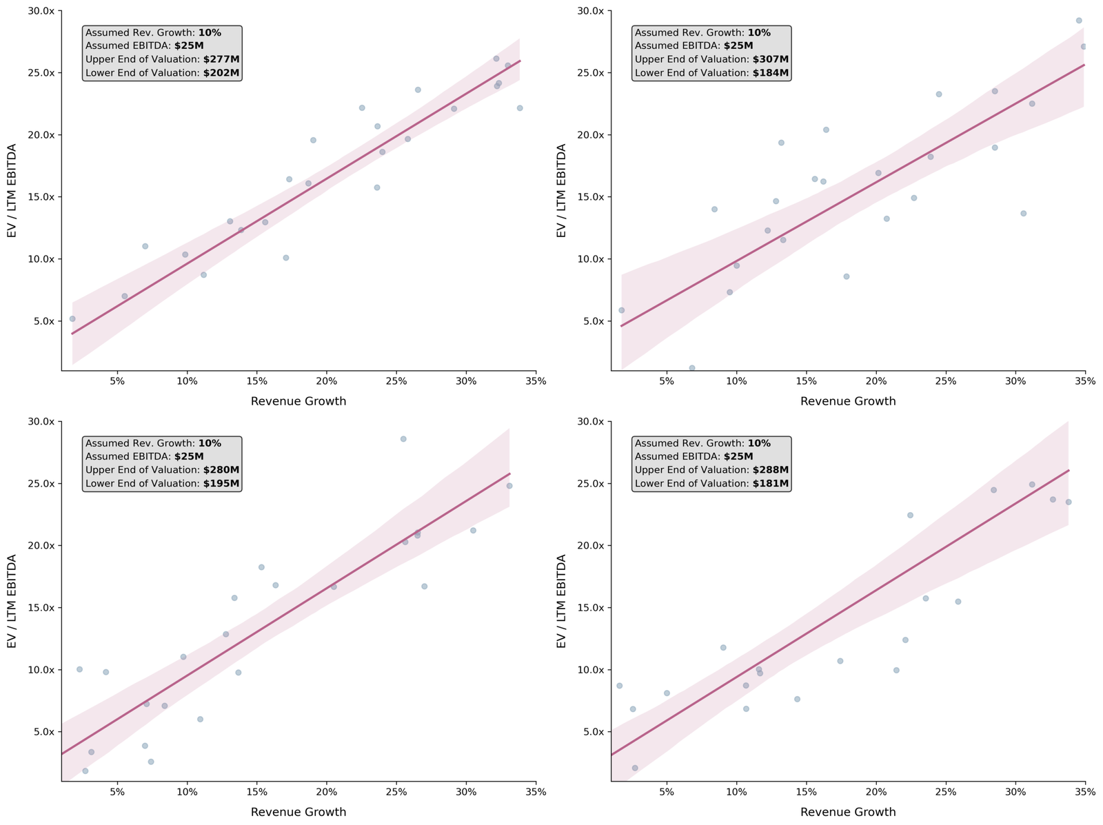
Figure 3: Four small sample simulations, depicting the variability in valuation ranges that can arise
We can also take an extremely conservative approach to establish outer bounds for added insight. Specifically, we’ll take the 95% confidence intervals of our parameter estimates (i.e., the intercept and slope) and use the lower and upper ends of both to deduce an extreme low- and high-end valuation range.
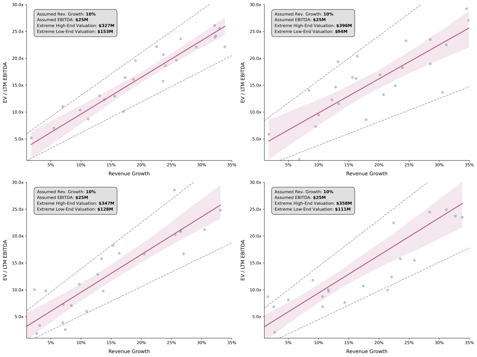
Figure 4: The same four simulations, now showing extreme valuation bounds
These extreme bounds – while statistically unconventional – give us a fuller picture of the uncertainty inherent in small-sample valuations, which is exactly what diligent advisors should communicate to their clients.